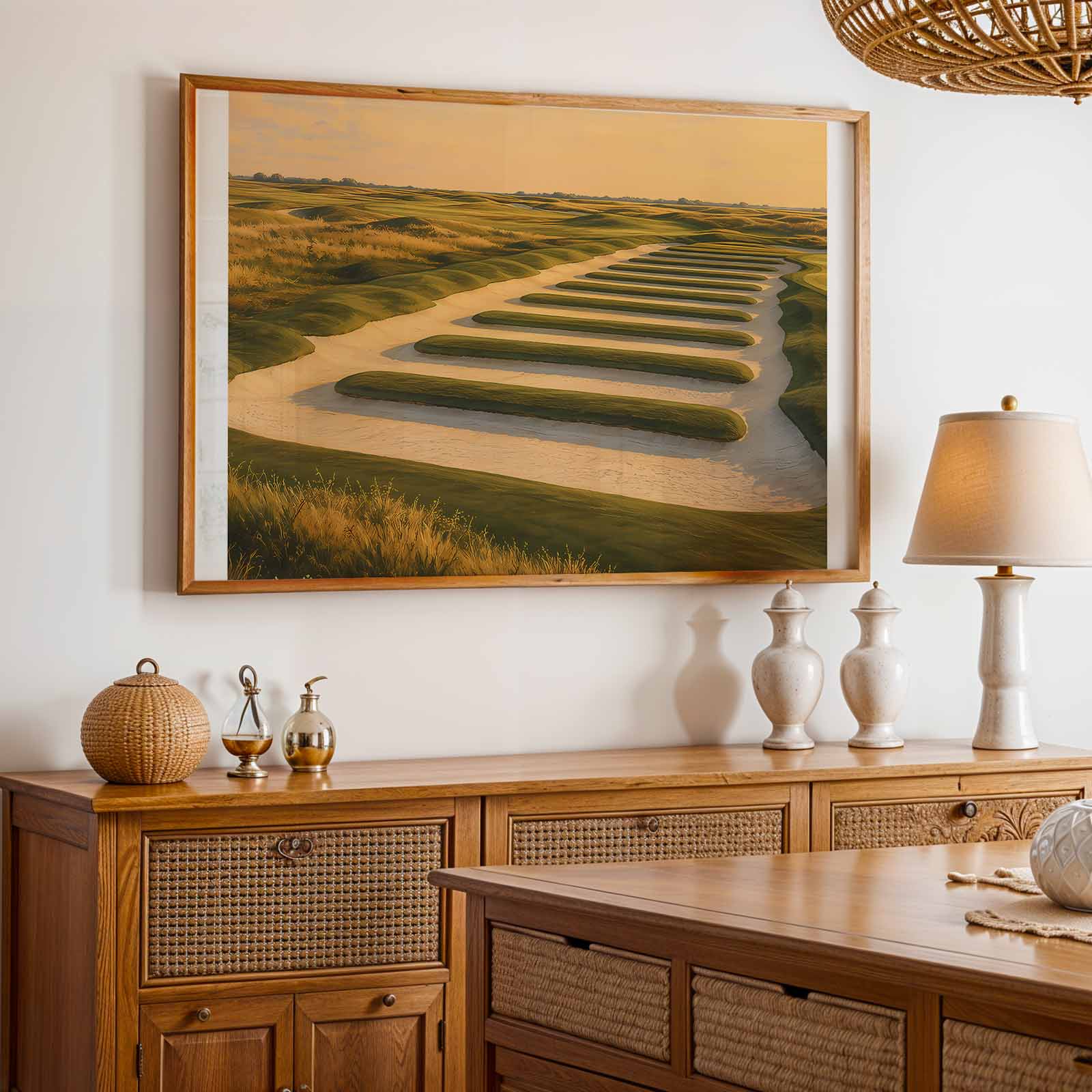
There are images that show a course and images that make a place. North Berwick, read through its sea-swept walls, ridged dunes and quietly insistent horizon, belongs to the latter. Seen as a poster rather than a scorecard, this landscape reads like an elegant study in light and texture: clipped greens and roughs become tonal planes, stone walls and bunkers draw the eye with simple geometry, and the sea beyond gives depth and a cool, steady distance. For presents for golf lovers who favour atmosphere over action, a North Berwick print arrives already composed — it asks only for a wall, a calm room, and time to look.
The power of course-led imagery lies in its ability to translate spatial memory into decorative presence. A fairway is not only a conduit for play but a line of movement across a wall: its sweep suggests rhythm, its breaks suggest scale. At North Berwick the fairway and green textures are immediate and recognisable without a player in sight. That quietness is the point. The grass, the dune contours and the clipped edges of putting surfaces form a vocabulary of subtle contrast — matte greens against the glossy sea, softened sand against the hard basalt of retaining walls — which reads beautifully from arm’s length and across a living room.
[IMAGE_INSERT_ARTICLE_01]
Light is the medium that turns course detail into mood. Morning or late-afternoon sun on a course like North Berwick sculpts relief: low light grazes the ridges and casts long, forgiving shadows from walls and humps. That light gives the print depth without drama, a restrained luminosity that calms a study or an office. When hung above a desk or behind a sofa, the image extends the room, suggesting a window onto a place rather than mere decoration. The horizon line and the sea’s flatness provide rest for the eye; the foreground’s textured greens invite closer inspection. The result is a piece that functions equally as art and as a spatial anchor.
Details such as stone walls, bunkers and single, wind-shaped trees act as punctuation marks in the composition. They are small, immediately memorable motifs that translate well to wall art because they offer both specificity and openness: recognisable markers that don’t demand narrative. This quality is why golf imagery from North Berwick reads so well in contemporary interiors. It is restrained but expressive, familiar without being literal, and it introduces a sense of place without cluttering the room’s visual language.
For anyone choosing presents for golf lovers who appreciate refined living, a North Berwick print offers staying power. Unlike action photography tied to a single swing or season, place-led images age gracefully. They function as quiet statements — a commitment to landscape, to calm, and to the idea that a course can be both a sporting ground and a site of visual poetry. In muted palettes and measured compositions, such prints become companions to books, leather, and timber: surfaces that reward touch and sight in equal measure.
Ultimately, the appeal of course-as-poster is that it privileges presence over performance. North Berwick’s composition — sea, walls, relief, and those immediately memorable details — produces a particular kind of calm, one that is at once precise and generous. Hung in a study or a living room, the image does more than fill a wall: it sets a tone, offers spatial depth, and invites repeated looking. For the discerning gift-giver, that is the essential promise of golf wall art: an image that gives a room room to breathe.