There is a particular kind of quiet that golf landscapes offer when they are translated into vintage art: not absence so much as economy — the economy of space, line and light. A poster of North Berwick, considered from the land itself, becomes an argument in favour of restraint. The sea edge, the low stone walls, the rolls and hollows of the turf and the few details that the eye remembers first are the visual grammar that give the image its decorative force. The result is a print that reads as a study in composed calm, ready to inhabit a living room, study or hallway without competing with the room's calm.
What makes such a scene compelling for wall art is how it reduces place to essentials. The broad, northern light that washes the fairways softens texture while sharpening contrast between turf and sand. That light gives the green a jewel-like quality from a distance and allows small architectural features — a sinuous wall, a weathered fence, a distant clubhouse silhouette — to act as punctuation marks. These elements create visual order: horizon lines that steady the eye, curving fairways that invite a slow reading, and succinct foreground details that anchor the composition. Seen this way, the course is less a sporting ground than a choreography of plane, shadow and quiet rhythm.
[IMAGE_INSERT_ARTICLE_01]
There is also a tactile logic to why North Berwick's landscape translates so well into a vintage poster. The relief of the land — its dips, ridges and hollows — becomes pattern when flattened into a print. Those patterns read at both a distance and up close: from afar they provide balanced shapes and tonal fields; close by they reward with texture and nuance in the way grass bites the light. A wall in a study or the end of a corridor benefits from that two-tiered attention: the piece is immediately restful when viewed across the room and quietly intricate when observed at leisure.
The sea is not merely background; it is a compositional device. Its horizontal calm contrasts with the verticality of walls and the sinuous lines of the links, establishing a sense of distance and breathable space. Colours in a tasteful vintage treatment — muted blues, soft greens, warm ochres — reinforce a decor-friendly palette that pairs easily with neutral interiors. This is art that carries an identity without shouting: it suggests a coastline wind and a distant, steady horizon rather than demanding narrative drama.
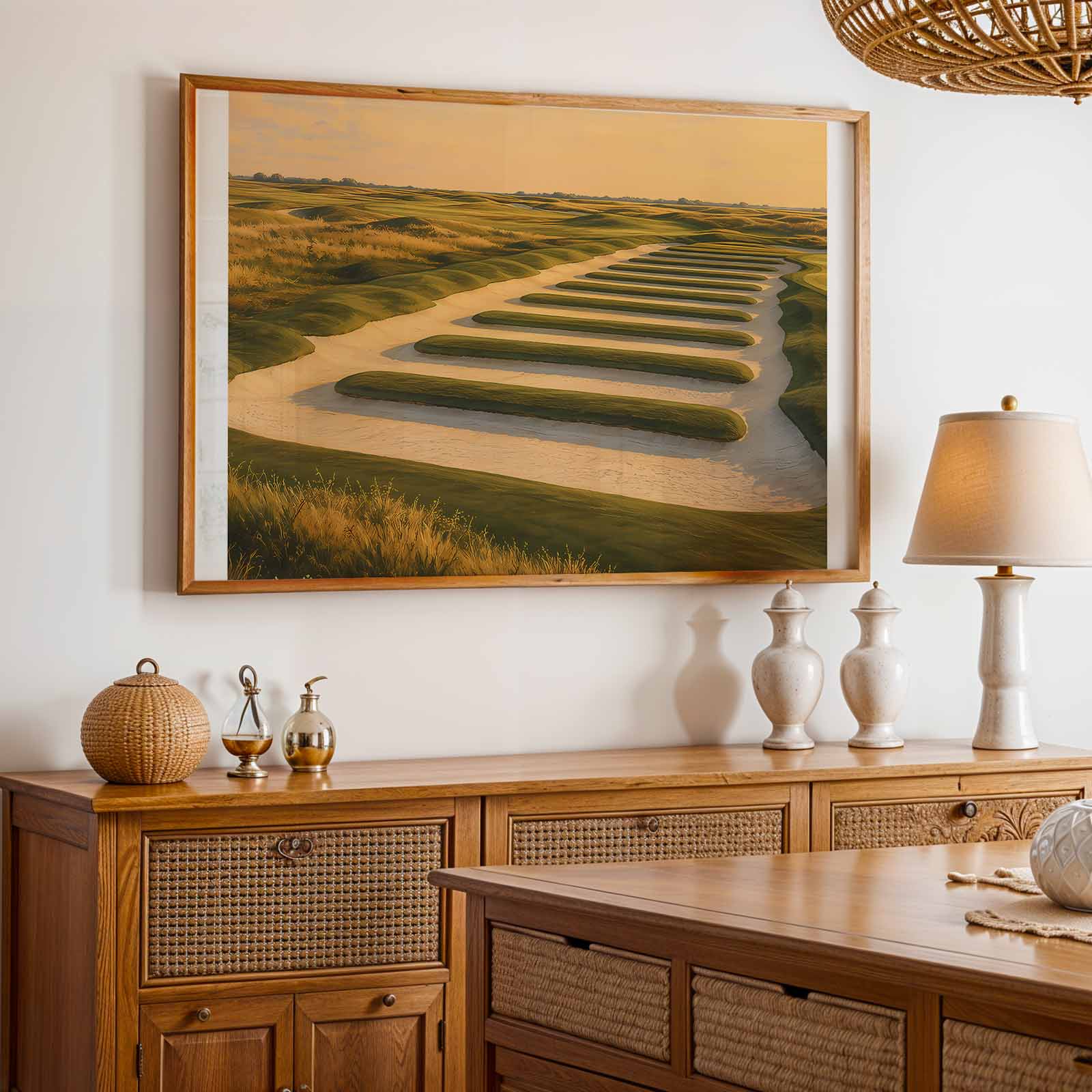
Another subtle reason these images endure is that golf courses are recognisable by form even when human presence is absent. Bunkers, greens, tees and the cadence of the fairway form an architectural language that the eye decodes instinctively. In a poster, these elements read as a composed geometry — an arrangement of forms and negative space — and that formal quality is what allows golf vintage art to sit comfortably alongside other refined pieces in a home. The absence of players means the viewer projects memory or mood onto the scene; the image therefore becomes both place and possibility.
Finally, consider the role of restraint in decorative longevity. A well-composed North Berwick print resists trendiness because its strength is atmospheric rather than topical. It offers a constant: a steady horizon, a measured rhythm of land, and a considered use of light. For anyone selecting art for an office, library or intimate living space, such a poster provides a politely insistent presence — calming, evocative, and assuredly decorative.
This is why course-led imagery functions so naturally as wall art: it speaks of place through landscape, not action; it brings the room a sense of ordered space and silent light; and it leaves the viewer with a lasting impression of calm and clarity.