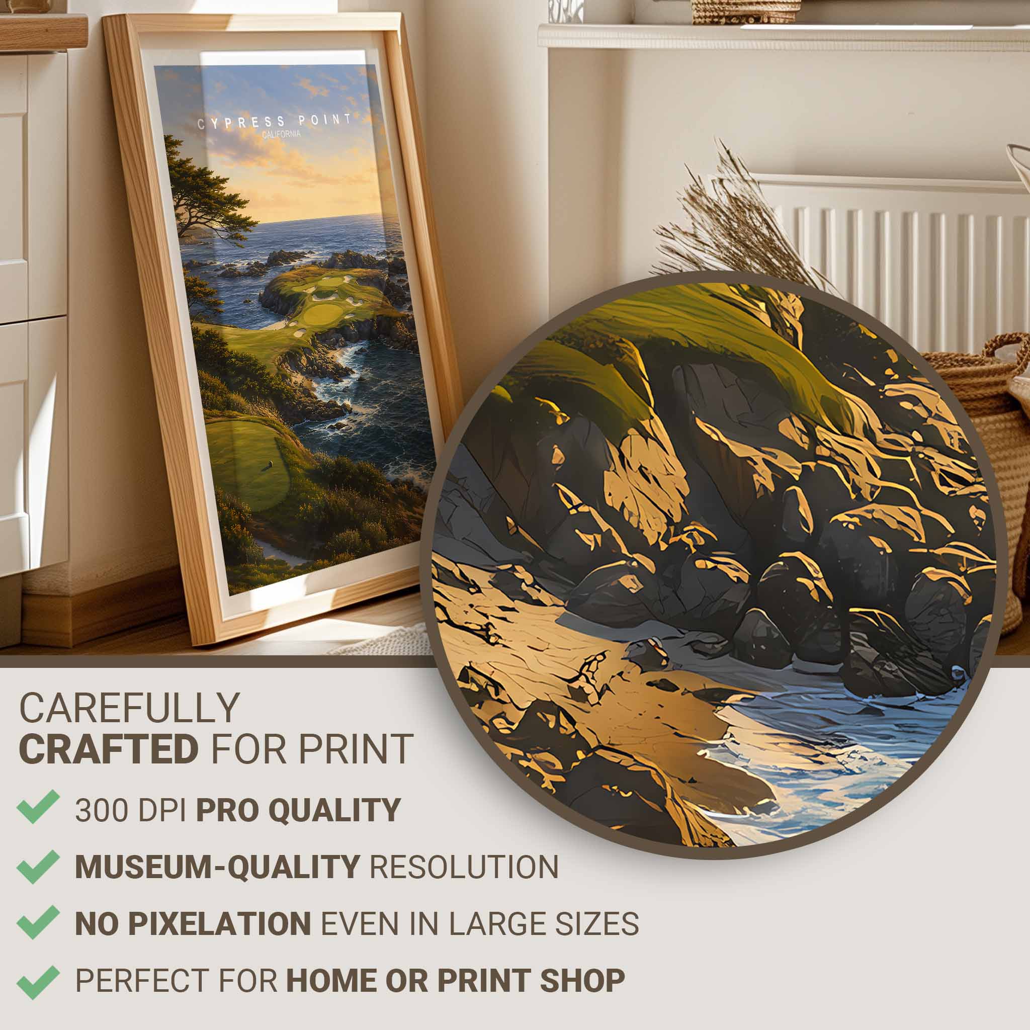
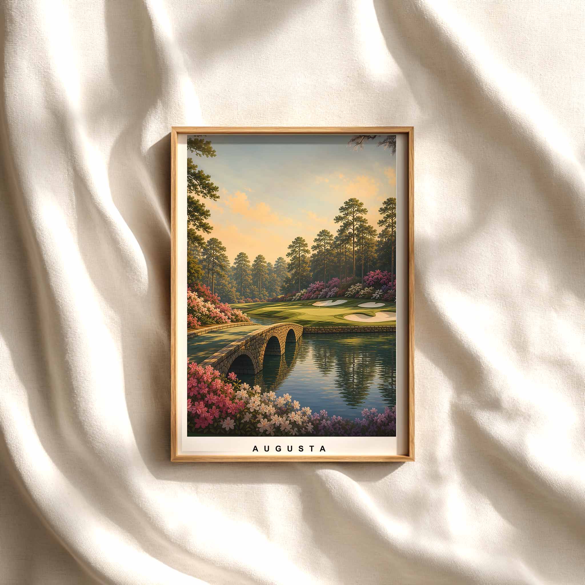
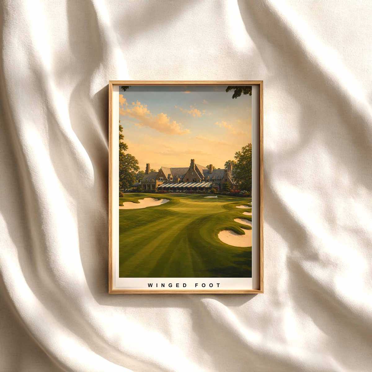
Malone Post: How Prestwick Imagery Shapes a Study or Clubhouse Ambience
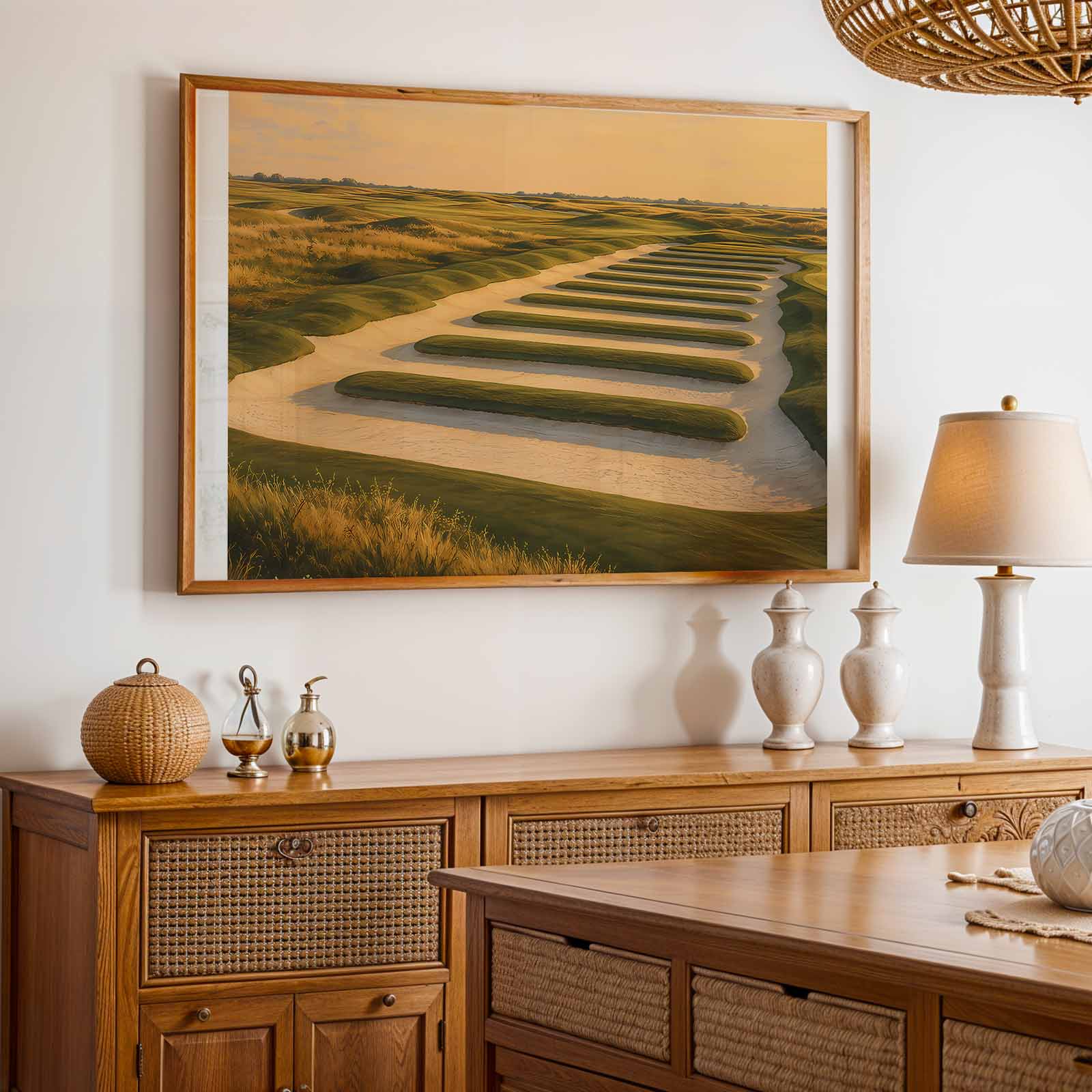
Prestwick’s imagery carries a particular composure: older greens, dune-like contours and long visual rails that read as both honest and quietly storied. For a study, home office or clubhouse, a Malone-style poster based on Prestwick translates the course’s weathered irregularities into a visual language of restraint. The result is not spectacle but a cultivated calm, a reminder of craft and continuity that anchors a room without shouting for attention.
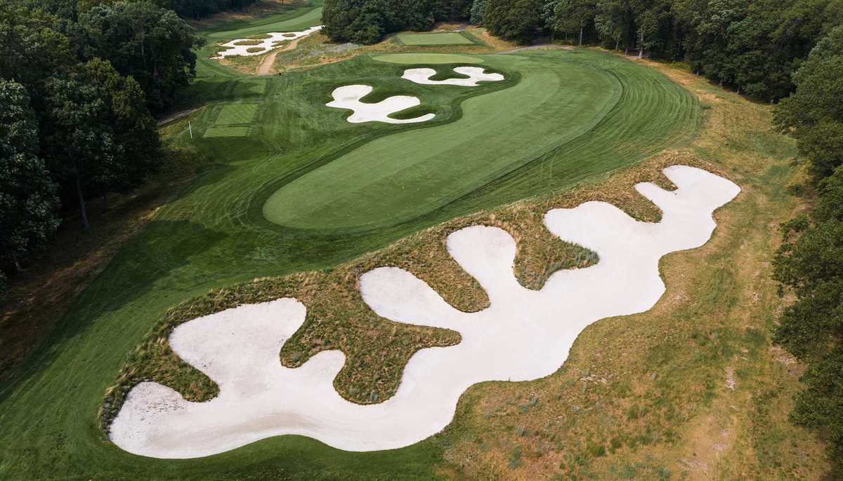
The course’s history and surviving fabric—one of golf’s oldest links with mid-19th-century origins—provide a legitimacy that makes imagery feel like heritage rather than mere motif. Images that emphasise the rumpled terrain, blind shots and the large, sculpted bunkers familiar to Prestwick offer textural depth: they pair naturally with warm woods, aged leather and the stacked edges of books. Those materials absorb the picture’s muted drama and return it to the room as an atmosphere of considered quiet.
Prestwick’s named features—the evocative silhouettes of places like the Himalayas and the Sahara bunker—create memorable visual moments. In an interior, such details act like shorthand for story: they reward quiet looking and invite conversation among those who know the course, while remaining intriguingly odd to the uninitiated. The visual railings and organic lines of the links give framed prints a compositional clarity that hangs well above a mantel, behind a leather club chair, or over a library desk.

What makes this imagery particularly suited to study or clubhouse settings is its pre-mechanised sensibility. The organic shaping of the land—contours and rolls formed without heavy earth-moving—reads as authentic and tactile in two dimensions. Paired with restrained framing and a muted palette, a print becomes less like a sporting poster and more like a piece of interior identity: heritage-oriented, quietly assertive and congenial to spaces designed for reflection.
In practice, Malone Post–style artwork drawn from Prestwick works best where materials and lighting are considerate. Natural woods, a soft lamp glow, leather upholstery and the presence of books create a setting that lets the image breathe. The print’s irregular lines and textured motifs relieve pristine minimalism, bringing warmth to a pared-back office while complementing the convivial, emblematic mood of a clubhouse lounge.
The audience for this kind of work is discerning rather than loud: golfers with an appreciation for history, collectors of course art, and anyone who prefers interiors that speak of provenance. Such imagery rewards attention and ages well alongside the storied objects that populate studies and clubhouses. It becomes part of a room’s narrative, a quiet testament to place and practice that does not interrupt but deepens the atmosphere.
Ultimately, a Malone Post inspired by Prestwick does more than decorate a wall. It imports a composed calm and a sense of continuity—the course’s irregular beauty and named landmarks rendered into a visual mood that suits reading, conversation and slow contemplation. In that way, the poster is both an emblem of golf culture and an interior tool: subtle, cultivated and quietly persuasive.
Author: Cynthia D.